 srcmini
先决条件: Python与pandas和xlsxwriter一起使用S1
Python Pandas是一个数据分析库。它可以读取, 过滤和重新排列大小数据集, 并以包括Excel在内的多种格式输出它们。
大熊猫使用XlsxWriter模块写入Excel文件。
XlsxWriter是用于以XLSX文件格式写入文件的Python模块。它可以用于将文本, 数字和公式写入多个工作表。此外, 它还支持格式设置, 图像, 图表, 页面设置, 自动过滤器, 条件格式设置等功能。
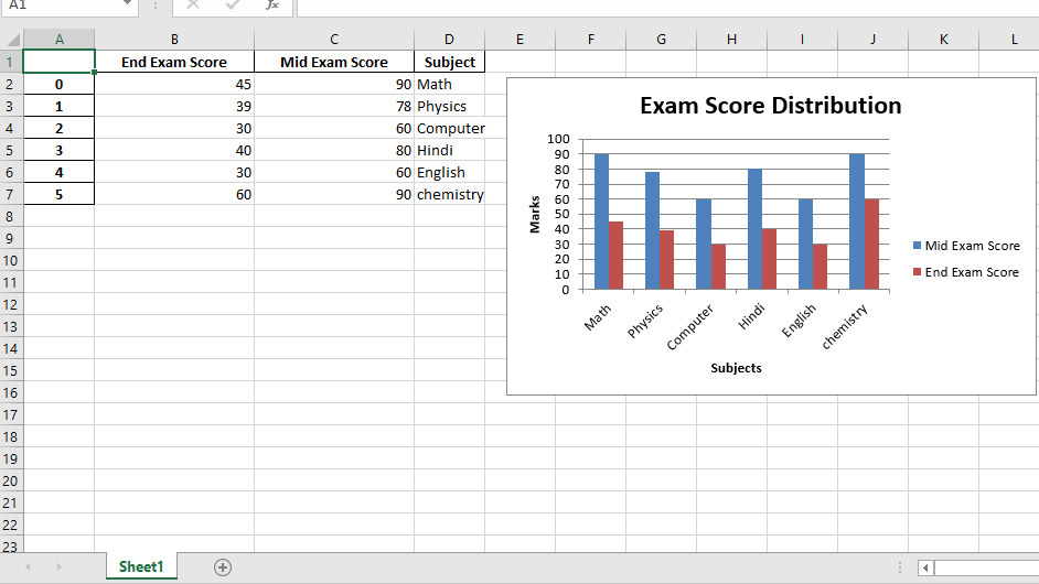
代码1:使用Pandas和XlsxWriter绘制柱形图。
# import pandas library as pd
import pandas as pd

# Create a Pandas dataframe from some data.
dataframe = pd.DataFrame({
                     'Subject' : [ "Math" , "Physics" , "Computer" , "Hindi" , "English" , "chemistry" ], 'Mid Exam Score' :  [ 90 , 78 , 60 , 80 , 60 , 90 ], 'End Exam Score' : [ 45 , 39 , 30 , 40 , 30 , 60 ] })

# Create a Pandas Excel writer
# object using XlsxWriter as the engine.
writer_object = pd.ExcelWriter( 'pandas_column_chart.xlsx' , engine = 'xlsxwriter' )

# Write a dataframe to the worksheet.
dataframe.to_excel(writer_object, sheet_name = 'Sheet1' )

# Create xlsxwriter workbook object .
workbook_object = writer_object.book

# Create xlsxwriter worksheet object
worksheet_object = writer_object.sheets[ 'Sheet1' ]

# set width of the B and C column
worksheet_object.set_column( 'B:C' , 20 )

# Create a chart object that can be added
# to a worksheet using add_chart() method.

# here we create a column chart object .
chart_object = workbook_object.add_chart({ 'type' : 'column' })

# Add a data series to a chart
# using add_series method.

# Configure the first series.
# syntax to define ranges is :
# [sheetname, first_row, first_col, last_row, last_col].
chart_object.add_series({
     'name' :       [ 'Sheet1' , 0 , 2 ], 'categories' : [ 'Sheet1' , 1 , 3 , 6 , 3 ], 'values' :     [ 'Sheet1' , 1 , 2 , 6 , 2 ], })

# Configure a second series.
chart_object.add_series({
     'name' :       [ 'Sheet1' , 0 , 1 ], 'categories' : [ 'Sheet1' , 1 , 3 , 6 , 3 ], 'values' :     [ 'Sheet1' , 1 , 1 , 6 , 1 ], })

# Add a chart title.
chart_object.set_title({ 'name' : 'Exam Score Distribution' })

# Add x-axis label
chart_object.set_x_axis({ 'name' : 'Subjects' })

# Add y-axis label
chart_object.set_y_axis({ 'name' : 'Marks' })

# add chart to the worksheet with given
# offset values at the top-left corner of
# a chart is anchored to cell E2
worksheet_object.insert_chart( 'E2' , chart_object, { 'x_offset' : 20 , 'y_offset' : 5 })

# Close the Pandas Excel writer
# object and output the Excel file.
writer_object.save()
输出:
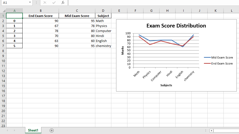
代码2:
使用Pandas和XlsxWriter绘制折线图。
# import pandas library as pd
import pandas as pd

# Create a Pandas dataframe from some data.
dataframe = pd.DataFrame({
                     'Subject' : [ "Math" , "Physics" , "Computer" , "Hindi" , "English" , "chemistry" ], 'Mid Exam Score' :  [ 95 , 78 , 80 , 80 , 60 , 95 ], 'End Exam Score' : [ 90 , 67 , 78 , 70 , 63 , 90 ]
                     })

# Create a Pandas Excel writer
# object using XlsxWriter as the engine.
writer_object = pd.ExcelWriter( 'pandas_line_chart.xlsx' , engine = 'xlsxwriter' )

# Write a dataframe to the worksheet.
dataframe.to_excel(writer_object, sheet_name = 'Sheet1' )

# Create xlsxwriter workbook object .
workbook_object = writer_object.book

# Create xlsxwriter worksheet object
worksheet_object = writer_object.sheets[ 'Sheet1' ]

# set width of the B and C column
worksheet_object.set_column( 'B:C' , 20 )


# Create a chart object that can be added
# to a worksheet using add_chart() method.

# here we create a line chart object .
chart_object = workbook_object.add_chart({ 'type' : 'line' })

# Add a data series to a chart
# using add_series method.

# Configure the first series.
# syntax to define ranges is :
# [sheetname, first_row, first_col, last_row, last_col].
chart_object.add_series({
     'name' :       [ 'Sheet1' , 0 , 2 ], 'categories' : [ 'Sheet1' , 1 , 3 , 6 , 3 ], 'values' :     [ 'Sheet1' , 1 , 2 , 6 , 2 ], })

# Configure a second series.
chart_object.add_series({
     'name' :       [ 'Sheet1' , 0 , 1 ], 'categories' : [ 'Sheet1' , 1 , 3 , 6 , 3 ], 'values' :     [ 'Sheet1' , 1 , 1 , 6 , 1 ], })

# Add a chart title.
chart_object.set_title({ 'name' : 'Exam Score Distribution' })

# Add x-axis label
chart_object.set_x_axis({ 'name' : 'Subjects' })

# Add y-axis label
chart_object.set_y_axis({ 'name' : 'Marks' })

# add chart to the worksheet with given
# offset values at the top-left corner of
# a chart is anchored to cell E2
worksheet_object.insert_chart( 'E2' , chart_object, { 'x_offset' : 20 , 'y_offset' : 5 })

# Close the Pandas Excel writer
# object and output the Excel file.
writer_object.save()
输出:
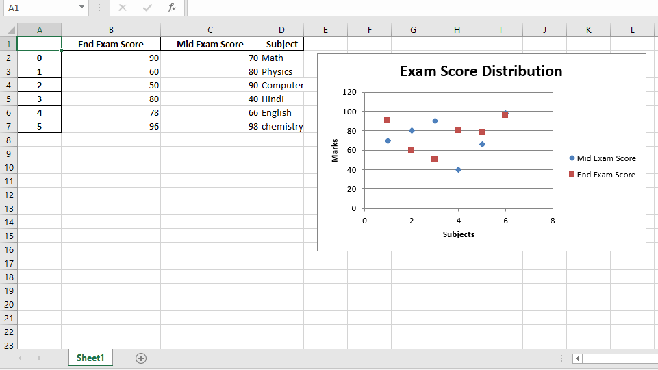
代码3:
使用Pandas和XlsxWriter绘制散点图。
# import pandas library as pd
import pandas as pd

# Create a Pandas dataframe from some data.
dataframe = pd.DataFrame({
                     'Subject' : [ "Math" , "Physics" , "Computer" , "Hindi" , "English" , "chemistry" ], 'Mid Exam Score' :  [ 70 , 80 , 90 , 40 , 66 , 98 ], 'End Exam Score' : [ 90 , 60 , 50 , 80 , 78 , 96 ]
                     })

# Create a Pandas Excel writer
# object using XlsxWriter as the engine.
writer_object = pd.ExcelWriter( 'pandas_Scatter_chart.xlsx' , engine = 'xlsxwriter' )

# Write a dataframe to the worksheet.
dataframe.to_excel(writer_object, sheet_name = 'Sheet1' )

# Create xlsxwriter workbook object .
workbook_object = writer_object.book

# Create xlsxwriter worksheet object
worksheet_object = writer_object.sheets[ 'Sheet1' ]

# set width of the B and C column
worksheet_object.set_column( 'B:C' , 20 )


# Create a chart object that can be added
# to a worksheet using add_chart() method.

# here we create a scatter chart object .
chart_object = workbook_object.add_chart({ 'type' : 'scatter' })

# Add a data series to a chart
# using add_series method.

# Configure the first series.
# syntax to define ranges is :
# [sheetname, first_row, first_col, last_row, last_col].
chart_object.add_series({
     'name' :       [ 'Sheet1' , 0 , 2 ], 'categories' : [ 'Sheet1' , 1 , 3 , 6 , 3 ], 'values' :     [ 'Sheet1' , 1 , 2 , 6 , 2 ], })

# Configure a second series.
chart_object.add_series({
     'name' :       [ 'Sheet1' , 0 , 1 ], 'categories' : [ 'Sheet1' , 1 , 3 , 6 , 3 ], 'values' :     [ 'Sheet1' , 1 , 1 , 6 , 1 ], })

# Add a chart title.
chart_object.set_title({ 'name' : 'Exam Score Distribution' })

# Add x-axis label
chart_object.set_x_axis({ 'name' : 'Subjects' })

# Add y-axis label
chart_object.set_y_axis({ 'name' : 'Marks' })

# add chart to the worksheet with given
# offset values at the top-left corner of
# a chart is anchored to cell E2
worksheet_object.insert_chart( 'E2' , chart_object, { 'x_offset' : 20 , 'y_offset' : 5 })

# Close the Pandas Excel writer
# object and output the Excel file.
writer_object.save()
输出:
注意怪胎!巩固你的基础Python编程基础课程和学习基础知识。
首先, 你的面试准备可通过以下方式增强你的数据结构概念:Python DS课程。
评论前必须登录!
注册