 srcmini
本文概述
毫无疑问, Bootstrap是(并且将持续很多时间)最令人敬畏的HTML, CSS和JavaScript框架之一, 你可以将其用作创建网站或Web应用程序的基础。除其他功能外, 它还包括用于排版, 图标, 表单, 按钮, 表格, 布局网格和导航的基本CSS和HTML, 以及定制的jquery-plugins和对响应布局的支持。
随着ReactJS的引入, 许多开发人员在日常开发过程中将其用作默认工具。这就意味着jQuery至少在开发非常动态的Web应用程序方面是有利的。但是, 用Bootstrap做什么jQuery?好吧, jQuery是使Bootstrap组件正常工作所必需的, 这是另一个问题, 原始的Bootstrap库使用浏览器的本机DOM, React实现了虚拟DOM。因此, 为了解决所有这些不便之处, 并保持使用Bootstrap作为UI基础的简单传统, 编写了React的bootstrap库。
这个库可以帮助你以React的方式工作, 同时使用强大且易于使用的Bootstrap功能。
1.安装React Bootstrap
React Bootstrap模块将所有Bootstrap 3组件实现为React组件, 因此它们可以轻松地嵌入到你的应用程序中。它不依赖jQuery, 因此你的代码将尽可能保持简洁。
要安装它, 请使用终端切换到项目目录, 并执行以下命令进行安装:
npm install react-bootstrap安装后, 你将能够需要原始Bootstrap库必须提供的任何组件。有关此库的更多信息, 请访问Github上的官方存储库。
2.定义你的Bootstrap主题
如你所知, 每个人都可以创建自己的boostrap主题, 或者仅使用默认主题。按照这个简单的指导方针, React-Bootstrap不依赖于任何版本的Bootstrap CSS, 也不实现自己的版本。显然, 你需要添加一些CSS以使Component看起来不错, 但这完全取决于你。最简单的方法是使用免费CDN(默认的且众所周知的基本Bootstrap主题)中的任何版本的Bootstrap CSS:
<!-- The default CSS of Bootstrap -->
<link href="https://maxcdn.bootstrapcdn.com/bootstrap/3.3.7/css/bootstrap.min.css" rel="stylesheet" integrity="sha384-BVYiiSIFeK1dGmJRAkycuHAHRg32OmUcww7on3RYdg4Va+PmSTsz/K68vbdEjh4u" crossorigin="anonymous">
或者, 你可以使用Bootswatch很棒的免费Bootstrap主题集合中的主题, 例如” United”, 它看起来比Bootstrap的默认主题好很多:
该过程非常简单, 只需在文档的head标记中包含一个CSS文件, 就可以开始了:
<!doctype html>
<html lang="en">
    <head>
        <meta charset="utf-8">
        <title>My Awesome React App</title>
        <meta name="viewport" content="width=device-width, initial-scale=1">

        <!-- Include some Bootstrap CSS Theme -->
        <link href="https://maxcdn.bootstrapcdn.com/bootswatch/3.3.7/united/bootstrap.min.css" rel="stylesheet" integrity="sha384-pVJelSCJ58Og1XDc2E95RVYHZDPb9AVyXsI8NoVpB2xmtxoZKJePbMfE4mlXw7BJ" crossorigin="anonymous">
    </head>

    <body>
        <div class="container">
            <div id="app">Loading...</div>
        </div>

        <script type="text/javascript" src="bundle.js"></script>
    </body>
</html>
这样, 现在你在React中的组件将看起来应有的样子。或者, 你可以配置webpack以包括和转换bootstrap的SASS源文件, 以便你可以根据需要配置和修改Bootstrap的样式。
3.在React中使用Bootstrap组件
作为React中的一种典型方法, 每个Bootstrap组件都可以从库中导入:
布局
Bootstrap最令人敬畏的功能之一是其革命性的布局网格系统。网格系统用于通过一系列容纳你的内容的行和列来创建页面布局。通常, 引导程序的每一行都包裹在普通容器或流体容器中。在React版本中, 这些组件被命名为Grid, 可以通过以下方式使用:
import Grid from 'react-bootstrap/lib/Grid';

const Container = (
    {/* Normal BS would be: <div class="container"></div>*/}
    <Grid>

    </Grid>
);

const ContainerFluid = (
    {/* Normal BS would be: <div class="container-fluid"></div>*/}
    <Grid fluid={true}>

    </Grid>
);
接下来是定义水平div的Row组件, 你可以在其中放置一些列:
import Row from 'react-bootstrap/lib/Row';

const MyRow = (
    {/* Normal BS would be: <div class="row"></div>*/}
    <Row>

    </Row>
);
最后是广为人知的引导程序响应列
import Grid from 'react-bootstrap/lib/Grid';
import Row from 'react-bootstrap/lib/Row';
import Col from 'react-bootstrap/lib/Col';
const MyAwesomeLayout = (
<Grid>
<Row>
<Col xs={12} md={8}>
{/* Some content */}
</Col>
<Col xs={6} md={4}>
{/* Some content */}
</Col>
</Row>
<Row>
<Col xs={6} md={4}>
{/* Some content */}
</Col>
<Col xs={6} md={4}>
{/* Some content */}
</Col>
<Col xsHidden md={4}>
{/* Some content */}
</Col>
</Row>
<Row>
<Col xs={6} xsOffset={6}>
{/* Some content */}
</Col>
</Row>
<Row>
<Col md={6} mdPush={6}>
{/* Some content */}
</Col>
<Col md={6} mdPull={6}>
{/* Some content */}
</Col>
</Row>
</Grid>
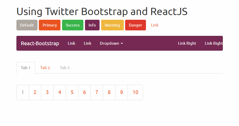
);纽扣
Bootstrap提供了不同样式的按钮, 这些按钮可以与React一样轻松地使用。使用普通引导程序, 你只需要提供一个类来定义按钮的样式, 现在在ReactJS中, 你可以使用bsStyle属性设置其类型:
import ButtonToolbar from 'react-bootstrap/lib/ButtonToolbar';
import Button from 'react-bootstrap/lib/Button';

const buttonsInstance = (
    <ButtonToolbar>
        {/* Standard button */}
        <Button>Default</Button>

        {/* Provides extra visual weight and identifies the primary action in a set of buttons */}
        <Button bsStyle="primary">Primary</Button>

        {/* Indicates a successful or positive action */}
        <Button bsStyle="success">Success</Button>

        {/* Contextual button for informational alert messages */}
        <Button bsStyle="info">Info</Button>

        {/* Indicates caution should be taken with this action */}
        <Button bsStyle="warning">Warning</Button>

        {/* Indicates a dangerous or potentially negative action */}
        <Button bsStyle="danger">Danger</Button>

        {/* Deemphasize a button by making it look like a link while maintaining button behavior */}
        <Button bsStyle="link">Link</Button>
    </ButtonToolbar>
);
模态
以下组件创建一个单击时显示模式的按钮。单击关闭按钮后, 对话框将自动关闭:
import React from 'react';

import Modal from 'react-bootstrap/lib/Modal';
import Button from 'react-bootstrap/lib/Button';

export default class App extends React.Component {
    constructor(props, context) {
        super(props, context);

        // Handle state
        this.state = {
            show: false
        };
    }

    render() {
        // Close the dialog
        let close = () => {
            this.setState({ show: false});
        };

        return (
            <div className="modal-container" style={{ height: 200 }}>
                <Button
                    bsStyle="primary"
                    bsSize="large"
                    onClick={() => this.setState({ show: true })}
                >
                    Launch contained modal
                </Button>

                <Modal
                    show={this.state.show}
                    onHide={close}
                    container={this}
                    aria-labelledby="contained-modal-title"
                >
                    <Modal.Header closeButton>
                        <Modal.Title id="contained-modal-title">Contained Modal</Modal.Title>
                    </Modal.Header>

                    <Modal.Body>
                        Elit est explicabo ipsum eaque dolorem blanditiis doloribus sed id ipsam, beatae, rem fuga id earum? Inventore et facilis obcaecati.
                    </Modal.Body>

                    <Modal.Footer>
                        <Button onClick={close}>Close</Button>
                    </Modal.Footer>
                </Modal>
            </div>
        );
    }
}
由于我们不想列出引导程序的所有组件, 而是最常用的组件, 因此你可以在官方的React Bootstrap网站上的文档中找到所有组件。
编码愉快!
评论前必须登录!
注册