 srcmini
导航栏或导航栏或菜单栏是任何Web或移动应用程序中最重要的组件。用户只能通过此菜单从一页导航到另一页。通常在网站顶部提供它, 以提供更好的UX(用户体验)。
方法:方法是先创建导航栏, 然后使用之前和徘徊选择器。
HTML代码:在本节中, 我们使用unordered-list(ul)创建了一个简单的导航栏菜单。
<!DOCTYPE html>
<html lang = "en">
<head>
<meta charset = "UTF-8">
<meta name = "viewport" content =
"width=device-width, initial-scale=1.0">
<title>Animated Navbar </title>
</head>
<body>
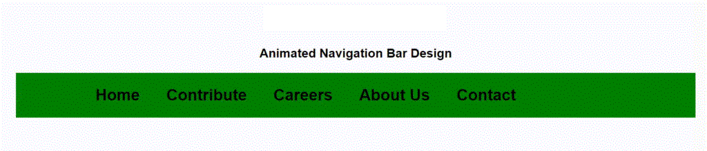
<h1>srcmini</h1>
<h3>Animated Navigation Bar Design</h3>
<ul>
<li><a href = "#">Home</a></li>
<li><a href = "#">Contribute</a></li>
<li><a href = "#">Careers</a></li>
<li><a href = "#">About Us</a></li>
<li><a href = "#">Contact</a></li>
</ul>
</body>
</html>CSS代码:在本节中, 我们使用了一些CSS属性来制作精美的动画导航栏。
- 第1步:首先, 我们使用flex属性以水平方式对齐列表。
- 第2步:然后删除所有文本装饰并提供所需的边距和填充。
- 第三步:然后, 我们在选择器之前使用, 在每个元素下方对齐一条线, 将其宽度保持为0。
- 步骤4:现在, 将鼠标悬停在before选择器上可为线条提供宽度, 并在x轴上对其进行变换以获得所需的效果。
<style>
     body {
         margin : 0 ;
         padding : 0 ;
         font-family : Arial , Helvetica , sans-serif ;
     }

     h 1 {
         color : green ;
     }

     h 1 , h 3 {
         text-align : center ;
     }

     ul {
         margin : 0 10% ;
         padding : 10px 0px 10px 100px ;
         display : flex;
         background : green ;
     }

     ul li {
         list-style : none ;
         padding : 10px 20px ;

     }

     ul li a {
         text-decoration : none ;
         font-size : 24px ;
         font-weight : bold ;
         color : black ;
         position : relative ;

     }

     ul li a::before {
         content : "" ;
         width : 0px ;
         height : 10px ;
         background : black ;
         position : absolute ;
         top : 100% ;
         left : 0 ;
         transition: . 5 s;
     }

     ul li a:hover::before {
         width : 50% ;
         transform: translateX( 100% );
     }
</style>
完整的代码:在本部分中, 我们将结合以上两个部分来创建动画导航栏。
<!DOCTYPE html>
<html lang = "en">

<head>
     <meta charset = "UTF-8">
     <meta name = "viewport" content =
         "width=device-width, initial-scale=1.0">
     <title>Animated Navbar </title>

     <style>
         body {
             margin: 0;
             padding: 0;
             font-family: Arial, Helvetica, sans-serif;
         }

         h1 {
             color: green;
         }

         h1, h3 {
             text-align: center;
         }

         ul {
             margin: 0 10%;
             padding: 10px 0px 10px 100px;
             display: flex;
             background: green;
         }

         ul li {
             list-style: none;
             padding: 10px 20px;

         }

         ul li a {
             text-decoration: none;
             font-size: 24px;
             font-weight: bold;
             color: black;
             position: relative;

         }

         ul li a::before {
             content: "";
             width: 0px;
             height: 10px;
             background: black;
             position: absolute;
             top: 100%;
             left: 0;
             transition: .5s;
         }

         ul li a:hover::before {
             width: 50%;
             transform: translateX(100%);
         }
     </style>
</head>

<body>
     <h1>srcmini</h1>

     <h3>Animated Navigation Bar Design</h3>
     <ul>
         <li><a href = "#">Home</a></li>
         <li><a href = "#">Contribute</a></li>
         <li><a href = "#">Careers</a></li>
         <li><a href = "#">About Us</a></li>
         <li><a href = "#">Contact</a></li>
     </ul>
</body>

</html>
输出如下:
评论前必须登录!
注册