 srcmini
本文概述
在推特上关注Ramnath Vaidyanathan。该分析最初在Google Colab上发布。
凯文·西斯特罗姆(Kevin Systrom)发表了一篇有关估算$ R_t $的有趣文章, 该度量被称为有效繁殖数。凯文在他的文章中将此数字描述为:
每t时刻感染人被感染的人的数量
凯文(Kevin)很友善, 可以将他的代码作为笔记本发布在github上。我想对他的模型做更多的事, 并将其应用于其他国家。但是, 鉴于我精通R, 所以我想先在R中复制他的结果。
在阅读本文的其余部分之前, 我强烈建议你阅读原始文章, 以更详细地了解所使用的建模方法, 因为本文将重点放在代码上。
建模方法和代码的全部功劳归于Kevin????。这本笔记本是我将他的模型转换为R时的卑微尝试。任何遗留的错误都是我的。
Bettencourt和Ribeiro
我们将使用Kevin在其文章中概述的相同方法, 该方法以Bettencourt和Ribeiro的论文为基础。
建模到达
第一步是模拟感染的”到达”过程。统计学家中到达分布的一种流行选择是泊松分布。因此, 如果我们让$ \ lambda $代表每天的平均感染率, 则我们每天可能会看到$ k $新病例的概率为:
$$ P(k | \ lambda)= \ frac {\ lambda ^ k e ^ {-\ lambda}} {k!} $$
在此设置下, 我们可以构建一组$ \ lambda $ s的新案例的概率分布。在开始编写代码之前, 我们需要加载tidyverse软件包集, 并自定义一些绘图选项(绘图尺寸, 绘图等)。你可以随意跳过本节, 因为它对叙述而言并不重要, 但请确保执行代码。
套餐和选项
# Load packages
library(tidyverse)

# Plot options

## Jupyter notebooks use the repr package to create viewable representations
## of R objects (https://github.com/IRkernel/repr). I am updating the default
## plot dimensions to 12 x 6.
options(repr.plot.width = 12, repr.plot.height = 6)

## We will use ggplot2 for all plots. I am defining a custom theme here
## that mainly updates the backgrounds and legend position. We set this
## custom theme as the default, and also update the default for line size.
theme_custom <- function(base_size, ...){
  ggplot2::theme_gray(base_size = base_size, ...) +
  ggplot2::theme(
    plot.title = element_text(face = 'bold'), plot.subtitle = element_text(color = '#333333'), panel.background = element_rect(fill = "#EBF4F7"), strip.background = element_rect(fill = "#33AACC"), legend.position = "bottom"
  )
}
ggplot2::theme_set(theme_custom(base_size = 20))
ggplot2::update_geom_defaults("line", list(size = 1.5))

# Utility functions

## We will use a utility function to display the head of dataframes.
## Note that we need this hack mainly to add the class 'dataframe' to
## the tables that are printed. This should ideally be handled
## by the `repr` package, and I will be sending a PR.
display_df <- function(x){
  d <- as.character(
    knitr::kable(x, format = 'html', table.attr = "class='dataframe'")
  )
  IRdisplay::display_html(d)
}

display_head <- function(x, n = 6){
   display_df(head(x, n))
}

display_random <- function(x, n = 6){
   display_df(dplyr::sample_n(x, n))
}
── [1mAttaching packages[22m ─────────────────────────────────────── tidyverse 1.3.0 ──
[32m✔[39m [34mggplot2[39m 3.3.0 [32m✔[39m [34mpurrr [39m 0.3.3
[32m✔[39m [34mtibble [39m 3.0.0 [32m✔[39m [34mdplyr [39m 0.8.5
[32m✔[39m [34mtidyr [39m 1.0.2 [32m✔[39m [34mstringr[39m 1.4.0
[32m✔[39m [34mreadr [39m 1.3.1 [32m✔[39m [34mforcats[39m 0.5.0
── [1mConflicts[22m ────────────────────────────────────────── tidyverse_conflicts() ──
[31m✖[39m [34mdplyr[39m::[32mfilter()[39m masks [34mstats[39m::filter()
[31m✖[39m [34mdplyr[39m::[32mlag()[39m masks [34mstats[39m::lag()
泊松分布
我们可以使用purrr的交叉函数来计算$ k $ s和$ \ lambda $ s组合的概率密度。这是一种优雅的方法, 尽管在计算上次优, 因为我们并未真正利用dpois的矢量化功能。在后面的部分中, 你将看到一种计算效率更高的方法。
# Number of new cases observed in a day
k = 0:69

# Arrival rate of new infections per day
lambda = c(10, 20, 30, 40)

poisson_densities = crossing(lambda = lambda, k = k) %>%
  mutate(p = dpois(k, lambda))

display_head(poisson_densities)
| lambda | k | p |
|---|---|---|
| 10 | 0 | 0.0000454 |
| 10 | 1 | 0.0004540 |
| 10 | 2 | 0.0022700 |
| 10 | 3 | 0.0075667 |
| 10 | 4 | 0.0189166 |
| 10 | 5 | 0.0378333 |
我们可以使用ggplot2可视化这些概率。注意我们如何利用表达式在图中绘制数学符号。你可以在plotmath的文档中阅读有关此内容的更多信息。
poisson_densities %>%
  # We convert lambda to a factor so that each line gets a discrete color
  mutate(lambda = factor(lambda)) %>%
  ggplot(aes(x = k, y = p, color = lambda)) +
  geom_line() +
  labs(
    title = expression(paste("Probability of k new cases P(k|", lambda, ")")), x = 'Number of new cases', y = NULL, color = expression(lambda)
  )

泊松似然
将到达过程建模为泊松分布, 使我们能够根据到达率$ \ lambda $预测一天中新病例的分布。但是, 实际上, 我们仅观察到达的次数。因此, 现在的关键问题是我们如何从观察到的到达数量开始了解$ \ lambda $的分布。幸运的是, 这个问题的答案很简单。
$$ L(\ lambda | k)= \ frac {\ lambda ^ k e ^ {-\ lambda}} {k!} $$
$ \ lambda $在k上的分布称为似然函数, 它的数学表达式与我们先前使用的概率质量函数相同。我们可以通过固定观察到的新病例数(k)并在$ \ lambda $的值范围内计算似然函数来形象化似然函数。
# Number of new cases observed in a day
k = 20

# Arrival rates of new infections per day
lambdas = seq(1, 45, length = 90)

# Compute likelihood and visualize them
tibble(lambda = lambdas, p = dpois(k, lambdas)) %>%
  ggplot(aes(x = lambda, y = p)) +
  geom_line(color = 'black') +
  labs(
    title = expression(paste("Poisson Likelihood L(", lambda, " | k"[t], ")")), x = expression(lambda), y = NULL
  )

连接$ \ lambda $和$ R_t $
所有这些都很好, 但是你可能想知道我们在一开始就谈到的有效感染率$ R_t $在哪里。它与到达率$ \ lambda $有什么关系。根据Bettencourt和Ribeiro的这篇论文, 这种关系非常简单
$$ \ lambda = k_ {t-1} e ^ {\ gamma(R_t-1)} $$
请注意, 这里的$ \ gamma $是连续间隔的倒数(对于COVID19, 大约为4天), $ k_ {t-1} $是在时间间隔$ t-1 $中观察到的新病例数。
我们可以对$ \ lambda $使用此表达式, 并根据$ R_t $重新构造似然函数。
$$ \ mathcal {L} \ left(R_t | k \ right)= \ frac {\ lambda ^ k e ^ {-\ lambda}} {k!} $$
在继续之前, 让我们设置一些核心参数。
# r_t_range is a vector of possible values for R_t
R_T_MAX = 12
r_t_range = seq(0, R_T_MAX, length = R_T_MAX*100 + 1)

# Gamma is 1/serial interval
# https://wwwnc.cdc.gov/eid/article/26/6/20-0357_article
GAMMA = 1/4

# New cases by day
k =  c(20, 40, 55, 90)
下面的代码展示了一种更有效的计算可能性的方法。除了使用R中函数的向量化性质以及具有嵌套数据帧的功能外, 我们没有为每个组合分别生成lambda和似然性。这样一来, 我们就可以每天生成lambda和可能性的向量, 然后使用tidyr :: unnest将其解压缩到一个平面表中。
除了计算效率外, 我认为该代码更具可读性, 并且以最小的开销来转换数学公式。
likelihoods <- tibble(day = seq_along(k) - 1, k = k) %>%
  # Compute a vector of likelihoods
  mutate(
    r_t = list(r_t_range), lambda = map(lag(k, 1), ~ .x * exp(GAMMA * (r_t_range - 1))), likelihood_r_t = map2(k, lambda, ~ dpois(.x, .y)/sum(dpois(.x, .y)))
  ) %>%
  # Ignore the 0th day
  filter(day > 0) %>%
  # Unnest the data to flatten it.
  select(-lambda) %>%
  unnest(c(r_t, likelihood_r_t))

display_random(likelihoods)
| day | k | r_t | likelihood_r_t |
|---|---|---|---|
| 1 | 40 | 7.26 | 0.0000000 |
| 1 | 40 | 2.54 | 0.0011292 |
| 2 | 55 | 3.54 | 0.0003426 |
| 2 | 55 | 5.62 | 0.0000000 |
| 1 | 40 | 7.03 | 0.0000000 |
| 3 | 90 | 10.84 | 0.0000000 |
现在, 我们可以根据观察到的新病例数来绘制可能性。
likelihoods %>%
  ggplot(aes(x = r_t, y = likelihood_r_t, color = factor(k))) +
  geom_line() +
  labs(
    title = expression(paste("Likelihood of R"[t], " given k")), subtitle = expression(paste("L(R"[t], "|k)")), x = expression("R"[t]), y = NULL, color = 'k'
  )

估算$ R_t $
在将新病例数$ k $和有效感染率$ R_t $联系起来方面, 我们取得了良好的进展。但是, 我们仍然没有从观察到的新病例的时间序列中估算其价值的切实方法。在这里, 无处不在的贝叶斯规则非常有用。 Bettencourt和Ribeiro将$ R_t $的概率分布表示为
$$ P(R_t | k_t)= \ frac {P(R_t)\ cdot \ mathcal {L}(k_t | R_t)} {P(k_t)} $$
凯文用更简单的术语解开了这个复杂的方程式。
这表示, 在看到????个新案例之后, 我们认为????????的分布等于:没有数据的$ P(R_t)$值的先验信念…乘以给定$ k $个新案例的可能性$ R_t $ …除以一般情况下看到这种情况的可能性。
如果我们使用前一期间的后验概率$ P(R_ {t-1} | k_ {t-1})$作为前一期间的$ P(R_t)$, 则可以重写前面的等式为:
$$ P(R_t | k_t)\ propto P(R_ {t-1} | k_ {t-1})\ cdot \ mathcal {L}(k_t | R_t)$$
遍历整个周期, 直到回到$ t = 0 $, 我们得到
$$ P(R_t | k_t)\ proto P(R_0)\ cdot {\ displaystyle \ prod ^ {T} _ {t = 0}} \ mathcal {L}(k_t | R_t)$$
使用统一的先验$ P(R_0)$, 则可简化为:
$$ P(R_t | k_t)\ propto {\ displaystyle \ prod ^ {T} _ {t = 0}} \ mathcal {L} \ left(k_t | R_t \ right)$$
现在, 我们可以使用该数学表达式从可能性中计算后验。再次, 我们使用向量化函数cumprod一次生成所有天的后验, 然后对其进行规范化。
posteriors <- likelihoods %>%
  group_by(r_t) %>%
  arrange(day) %>%
  mutate(posterior = cumprod(likelihood_r_t)) %>%
  group_by(k) %>%
  mutate(posterior = posterior / sum(posterior)) %>%
  ungroup()

display_random(posteriors)
| day | k | r_t | likelihood_r_t | posterior |
|---|---|---|---|---|
| 3 | 90 | 5.85 | 0.0000000 | 0.0000000 |
| 3 | 90 | 2.35 | 0.0033847 | 0.0025235 |
| 3 | 90 | 7.68 | 0.0000000 | 0.0000000 |
| 2 | 55 | 0.01 | 0.0000047 | 0.0000000 |
| 1 | 40 | 0.79 | 0.0000009 | 0.0000009 |
| 3 | 90 | 10.81 | 0.0000000 | 0.0000000 |
现在我们可以可视化后验分布。
posteriors %>%
  ggplot(aes(x = r_t, y = posterior, color = factor(day))) +
  geom_line() +
  labs(
    title = expression(paste("Posterior probability of R"[t], " given k")), subtitle = expression(paste("P(R"[t], "| k)")), x = expression("R"[t]), y = NULL, color = 'day'
  )

这些后代现在使我们能够回答所有重要的问题:
每天$ R_t $最可能的值是多少?
在估计任何数量时, 提供有关估计的误差的感觉非常重要。一种流行的方法是使用最高密度间隔。
概括分布的另一种方法是最高密度区间, 该密度区间通过指定跨越大部分分布(即分布的95%)的区间来概括分布, 以使区间内的每个点的可信度都高于区间外的任何点。
Kevin在他的文章中实现了一种蛮力算法来计算HDI。 R用户更幸运的是, 已经有了一个带有实现????的软件包HDInterval。
现在, 我们将估计$ R_t $最可能的值以及其周围的最大密度区间。由于HDInterval :: hdi函数仅适用于分布中的随机值向量, 并且我们仅估计了后验概率, 因此我们将需要使用后验概率来模拟$ R_t $的随机值, 以便计算最高密度间隔。
# Install and load HDInterval package
install.packages("HDInterval")
library(HDInterval)

# Compute the most likely value of r_t and the highest-density interval
estimates <- posteriors %>%
  group_by(day) %>%
  summarize(
    r_t_simulated = list(sample(r_t_range, 10000, replace = TRUE, prob = posterior)), r_t_most_likely = r_t_range[which.max(posterior)]
  ) %>%
  mutate(
    r_t_lo = map_dbl(r_t_simulated, ~ hdi(.x)[1]), r_t_hi = map_dbl(r_t_simulated, ~ hdi(.x)[2])
  ) %>%
  select(-r_t_simulated)

display_head(estimates)
Installing package into ‘/usr/local/lib/R/site-library’
(as ‘lib’ is unspecified)
| day | r_t_most_likely | r_t_lo | r_t_hi |
|---|---|---|---|
| 1 | 3.77 | 2.45 | 4.96 |
| 2 | 2.84 | 2.04 | 3.65 |
| 3 | 2.90 | 2.28 | 3.44 |
我们可以使用带有色带的折线图来可视化这些估计和周围的不确定性。
estimates %>%
  ggplot(aes(x = day, y = r_t_most_likely)) +
  geom_point(color = "#ffc844", size = 5) +
  geom_line(color = 'black') +
  geom_ribbon(aes(ymin = r_t_lo, ymax = r_t_hi), fill = "#ffc844", alpha = 0.3) +
  labs(
    title = expression(paste('R'[t], ' by day')), subtitle = "The band represents the highest density interval", x = 'Day', y = NULL
  )

虽然Bettencourt和Ribeiro的方法效果很好, 但Kevin指出了一个实际问题(在论文中也已指出), 由于后方无法忘记与高$ R_t $。
为了解决这个问题, Kevin建议采用以下方法。
因此, 我建议仅合并似然函数的最后$ m $天。通过这样做, 基于最近的过去来建立算法的先验, 这比整个流行病史要有用得多。因此, 此简单但重要的更改导致以下结果:$$ P(R_t | k_t)\ propto {\ displaystyle \ prod ^ {T} _ {t = Tm}} \ mathcal {L} \ left(k_t | R_t \右)$$
我们将使用此修改来估计美国不同州之间$ R_t $的值。
适用于美国数据
现在是时候采用我们制造的所有这些设备, 并将其应用于美国各州的COVID数据, 以估算有效感染率$ R_t $。让我们从获取数据开始。我们将使用《纽约时报》构建的美国的COVID数据集。
url = 'https://raw.githubusercontent.com/nytimes/covid-19-data/master/us-states.csv'
covid_cases <- readr::read_csv(url)

display_head(covid_cases)
Parsed with column specification:
cols(
date = [34mcol_date(format = "")[39m, state = [31mcol_character()[39m, fips = [31mcol_character()[39m, cases = [32mcol_double()[39m, deaths = [32mcol_double()[39m
)
| 日期 | 州 | ps | 案件 | 死亡人数 |
|---|---|---|---|---|
| 2020-01-21 | 华盛顿州 | 53 | 1 | 0 |
| 2020-01-22 | 华盛顿州 | 53 | 1 | 0 |
| 2020-01-23 | 华盛顿州 | 53 | 1 | 0 |
| 2020-01-24 | 伊利诺伊州 | 17 | 1 | 0 |
| 2020-01-24 | 华盛顿州 | 53 | 1 | 0 |
| 2020-01-25 | 加利福尼亚州 | 06 | 1 | 0 |
顺利处理新案件
第一步是通过每天计算新病例数并在滚动窗口中进行平滑处理来准备数据。平滑对于解决报告中的延迟至关重要。人们发现, 这种滞后在周末特别明显。
按照Kevin的方法, 我使用具有7天滚动窗口的高斯平滑器。
注意, 我们将所有数据处理步骤实现为独立功能。虽然这增加了一些开销, 但它使我们能够清晰地构成这些步骤, 并将它们应用于一个或多个状态, 这将非常方便。
我们将这些步骤应用于一个选定的状态, 因此更容易查看结果并从中弄清楚。我选择了纽约, 但随时将其切换到你选择的状态!
# Install the smoother package
install.packages("smoother")

#' Compute new cases and smooth them
smooth_new_cases <- function(cases){
  cases %>%
    arrange(date) %>%
    mutate(new_cases = c(cases[1], diff(cases))) %>%
    mutate(new_cases_smooth = round(
      smoother::smth(new_cases, window = 7, tails = TRUE)
    )) %>%
    select(state, date, new_cases, new_cases_smooth)
}

state_selected <- "New York"
covid_cases %>%
  filter(state == state_selected) %>%
  smooth_new_cases() %>%
  display_head()
Installing package into ‘/usr/local/lib/R/site-library’
(as ‘lib’ is unspecified)
| 州 | 日期 | new_cases | new_cases_smooth |
|---|---|---|---|
| 纽约 | 2020-03-01 | 1 | 1 |
| 纽约 | 2020-03-02 | 0 | 2 |
| 纽约 | 2020-03-03 | 1 | 4 |
| 纽约 | 2020-03-04 | 9 | 9 |
| 纽约 | 2020-03-05 | 11 | 15 |
| 纽约 | 2020-03-06 | 22 | 23 |
让我们绘制new_cases的原始值和平滑值, 以便我们可视化平滑过程在做什么。
make进行一些数据转换后, 最好直观地显示结果。这使你可以建立直觉并进行健全性检查, 以确保你的转换正在按照你的预期进行!
plot_new_cases <- function(cases){
  cases %>%
    ggplot(aes(x = date, y = new_cases)) +
    geom_line(linetype = 'dotted', color = 'gray40') +
    geom_line(aes(y = new_cases_smooth), color = "#14243e") +
    labs(
      title = "New cases per day", subtitle = unique(cases$state), x = NULL, y = NULL
    )
}

covid_cases %>%
  filter(state == state_selected) %>%
  smooth_new_cases() %>%
  plot_new_cases()

计算可能性
第二步是计算可能性。我们将使用与之前相同的方法, 但有一个明显的不同。我们将计算对数可能性而不是可能性。这将使在滚动窗口上平滑它们更容易以应用Kevin建议的修改, 即仅使用最新的$ m $间隔来计算$ R_t $。
和以前一样, 我们将每天的可能性作为嵌套列表进行计算, 然后使用tidyr :: unnest将结果展平为表格。
????使用数据时, 列表列非常方便。这里使用的设计模式在许多情况下非常有用。
compute_likelihood <- function(cases){
  likelihood <- cases %>%
    filter(new_cases_smooth > 0) %>%
    mutate(
      r_t = list(r_t_range), lambda = map(lag(new_cases_smooth, 1), ~ .x * exp(GAMMA * (r_t_range - 1))), likelihood_r_t = map2(new_cases_smooth, lambda, dpois, log = TRUE)
    ) %>%
    slice(-1) %>%
    select(-lambda) %>%
    unnest(c(likelihood_r_t, r_t))
}

covid_cases %>%
  filter(state == state_selected) %>%
  smooth_new_cases() %>%
  compute_likelihood() %>%
  display_random()
| 州 | 日期 | new_cases | new_cases_smooth | _ | likelihood_r_t |
|---|---|---|---|---|---|
| 纽约 | 2020-03-24 | 4790 | 5677 | 5.36 | -4010.9111 |
| 纽约 | 2020-03-21 | 3254 | 3614 | 7.33 | -5054.4656 |
| 纽约 | 2020-04-07 | 9378 | 9094 | 5.90 | -10331.2552 |
| 纽约 | 2020-03-13 | 95 | 118 | 7.01 | -144.3349 |
| 纽约 | 2020-04-10 | 10575 | 9895 | 11.69 | -107594.6949 |
| 纽约 | 2020-04-10 | 10575 | 9895 | 8.46 | -35816.2131 |
计算后验
第三步是计算后验概率。回想起那
$$ P(R_t | k_t)\ propto {\ displaystyle \ prod ^ {T} _ {t = T-m}} \ mathcal {L} \ left(k_t | R_t \ right)$$
我们可以根据对数似然来重写它
$$ P(R_t | k_t)\ propto {\ displaystyle \ exp \ big(\ sum ^ {T} _ {t = Tm}} \ log(\ mathcal {L} \ left(k_t | R_t \ right))\大)$$
我们可以使用zoo软件包中的rollapplyr函数来计算对数似然的7天滚动总和, 然后对其求幂以计算后验。最后, 我们将后代标准化为1.0。
compute_posterior <- function(likelihood){
  likelihood %>%
    arrange(date) %>%
    group_by(r_t) %>%
    mutate(posterior = exp(
      zoo::rollapplyr(likelihood_r_t, 7, sum, partial = TRUE)
    )) %>%
    group_by(date) %>%
    mutate(posterior = posterior / sum(posterior, na.rm = TRUE)) %>%
    # HACK: NaNs in the posterior create issues later on. So we remove them.
    mutate(posterior = ifelse(is.nan(posterior), 0, posterior)) %>%
    ungroup() %>%
    select(-likelihood_r_t)
}

covid_cases %>%
  filter(state == state_selected) %>%
  smooth_new_cases() %>%
  compute_likelihood() %>%
  compute_posterior() %>%
  display_random()
| 州 | 日期 | new_cases | new_cases_smooth | r_t | posterior |
|---|---|---|---|---|---|
| 纽约 | 2020-04-14 | 7177 | 8311 | 0.51 | 0.0000000 |
| 纽约 | 2020-03-19 | 1770 | 1921 | 11.62 | 0.0000000 |
| 纽约 | 2020-03-25 | 7401 | 6094 | 5.46 | 0.0000000 |
| 纽约 | 2020-03-22 | 4812 | 4455 | 0.53 | 0.0000000 |
| 纽约 | 2020-03-20 | 2950 | 2753 | 8.64 | 0.0000000 |
| 纽约 | 2020-03-05 | 11 | 15 | 2.44 | 0.0020211 |
让我们可视化我们计算出的后验概率。请注意, 我们如何设置alpha = 0.2以减少重复绘制的次数。这使我们可以直观地看到不断变化的后代。
plot_posteriors <- function(posteriors){
  posteriors %>%
    ggplot(aes(x = r_t, y = posterior, group = date)) +
    geom_line(alpha = 0.2) +
    labs(
      title = expression(paste("Daily Posterior of R"[t], " by day")), subtitle = unique(posteriors$state), x = '', y = ''
    ) +
    coord_cartesian(xlim = c(0.4, 4)) +
    theme(legend.position = 'none')
}

covid_cases %>%
  filter(state == state_selected) %>%
  smooth_new_cases() %>%
  compute_likelihood() %>%
  compute_posterior() %>%
  plot_posteriors()

估计Rt
最后一步是估计$ R_t $的值以及它们周围的最高密度间隔。回想一下, 我们需要使用后验概率来模拟$ r_t $的随机值, 以便应用HDIInterval :: hdi函数来计算最高密度区间。
# Estimate R_t and a 95% highest-density interval around it
estimate_rt <- function(posteriors){
  posteriors %>%
    group_by(state, date) %>%
    summarize(
      r_t_simulated = list(sample(r_t_range, 10000, replace = TRUE, prob = posterior)), r_t_most_likely = r_t_range[which.max(posterior)]
    ) %>%
    mutate(
      r_t_lo = map_dbl(r_t_simulated, ~ hdi(.x)[1]), r_t_hi = map_dbl(r_t_simulated, ~ hdi(.x)[2])
    ) %>%
    select(-r_t_simulated)
}

covid_cases %>%
  filter(state == state_selected) %>%
  smooth_new_cases() %>%
  compute_likelihood() %>%
  compute_posterior() %>%
  estimate_rt() %>%
  display_random()
| 州 | 日期 | r_t_most_likely | r_t_lo | r_t_hi |
|---|---|---|---|---|
| 纽约 | 2020-03-14 | 2.05 | 1.68 | 2.36 |
| 纽约 | 2020-03-22 | 2.33 | 2.27 | 2.39 |
| 纽约 | 2020-03-07 | 2.62 | 1.73 | 3.46 |
| 纽约 | 2020-03-09 | 2.01 | 1.32 | 2.63 |
| 纽约 | 2020-04-04 | 1.18 | 1.15 | 1.21 |
| 纽约 | 2020-04-06 | 1.08 | 1.05 | 1.11 |
最后, 我们来到了关键时刻!让我们可视化$ R_t $的估计值
plot_estimates <- function(estimates){
  estimates %>%
    ggplot(aes(x = date, y = r_t_most_likely)) +
    geom_point(color = "darkorange", alpha = 0.8, size = 4) +
    geom_line(color = "#14243e") +
    geom_hline(yintercept = 1, linetype = 'dashed') +
    geom_ribbon(
      aes(ymin = r_t_lo, ymax = r_t_hi), fill = 'darkred', alpha = 0.2
    ) +
    labs(
      title = expression('Real time R'[t]), x = '', y = '', subtitle = unique(estimates$state)
    ) +
    coord_cartesian(ylim = c(0, 4))
}

covid_cases %>%
  filter(state == state_selected) %>%
  smooth_new_cases() %>%
  compute_likelihood() %>%
  compute_posterior() %>%
  estimate_rt() %>%
  plot_estimates()

那么, 这与Kevin的文章中的估算值相比如何呢?我的模型中的初始估算似乎与Kevin的估算不符。但是, 这可能是平滑算法差异的函数, 或者是初始估计值周围的较大不确定性。曲线的整体形状和峰顶似乎非常接近。任务完成! ????

遍历所有状态
现在是时候遍历所有状态并计算这些估计值了。我们可以通过按状态分组, 将数据按每个状态分成一个表, 然后使用purrr :: map_df估算每个状态的$ R_t $并将它们组合回到一个表中来轻松地做到这一点。
# ⚠️This function can take a couple of minutes to run
#   as it loops across all states
estimates_all <- covid_cases %>%
  filter(date >= "2020-03-01") %>%
  group_by(state) %>%
  # Ignore states that have not reached 100 infections
  filter(max(cases) > 100 ) %>%
  group_split() %>%
  map_df(~ {
    .x %>%
      smooth_new_cases() %>%
      compute_likelihood() %>%
      compute_posterior() %>%
      estimate_rt()
  }) %>%
  ungroup()
estimates_all %>%
  display_random()
| 州 | 日期 | r_t_most_likely | r_t_lo | r_t_hi |
|---|---|---|---|---|
| 新泽西州 | 2020-03-15 | 2.72 | 2.01 | 3.42 |
| 阿拉斯加州 | 2020-04-02 | 0.80 | 0.04 | 1.54 |
| 马里兰州 | 2020-03-12 | 1.67 | 0.00 | 3.33 |
| 华盛顿州 | 2020-03-10 | 2.01 | 1.49 | 2.52 |
| 新墨西哥 | 2020-03-28 | 1.58 | 0.89 | 2.17 |
| 南达科他州 | 2020-04-08 | 1.63 | 1.12 | 2.09 |
现在, 我们可以创建所有州的估算值的较小倍数图。 ggplot2的使用使这变得非常容易, 我们所要做的只是增加一行代码!
# Increase plot height and width
options(repr.plot.height = 40, repr.plot.width = 20)
estimates_all %>%
  plot_estimates() +
  facet_wrap(~ state, ncol = 4) +
  labs(subtitle = "")

# Reset plot dimensions
options(repr.plot.height = 12, repr.plot.width = 8)

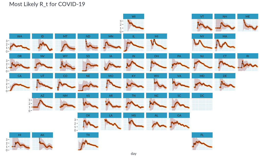
虽然小倍数图很完美, 但是很难根据其地理位置导航到某个州。如果我们可以绘制每个州靠近其地理位置的位置怎么办?
值得庆幸的是, 瑞安·哈芬(Ryan Hafen)创建了geofacet软件包, 使我们可以用一行代码在地理网格上布置这些小的倍数。
Unfortunately️不幸的是, 我无法在colab上安装geofacet软件包(我怀疑是由于sf软件包所需的系统依赖性), 因此下面的代码块将无法执行。我包括了在本地生成的图的保存版本, 因此你可以了解它的外观。
# ⚠️ CAUTION: This code will error on colab
# options(repr.plot.height = 40, repr.plot.width = 20)
# estimates_all %>%
#  mutate(state = state.abb[match(state, state.name)]) %>%
#  plot_estimates() +
#  geofacet::facet_geo(~ state, ncol = 4) +
#  labs(subtitle = "") +
#  theme(strip.text = element_text(hjust = 0))
# options(repr.plot.height = 12, repr.plot.width = 8)
最后, 让我们重新创建Kevin文章中的图, 该图基于$ R_t $的最可能估计值对状态进行排序, 并根据锁定状态为状态着色。
⚠️请注意, 这只是一个描述性的情节, 无法就锁定效果得出任何结论
options(repr.plot.width = 20, repr.plot.height = 8)
no_lockdown = c('North Dakota', 'South Dakota', 'Nebraska', 'Iowa', 'Arkansas')
partial_lockdown = c('Utah', 'Wyoming', 'Oklahoma')
estimates_all %>%
  group_by(state) %>%
  filter(date == max(date)) %>%
  ungroup() %>%
  mutate(state = forcats::fct_reorder(state, r_t_most_likely)) %>%
  mutate(lockdown = case_when(
    state %in% no_lockdown ~ 'None', state %in% partial_lockdown ~ 'Partial', TRUE ~ "Full"
  )) %>%
  ggplot(aes(x = state, y = r_t_most_likely)) +
  geom_col(aes(fill = lockdown)) +
  geom_hline(yintercept = 1, linetype = 'dotted') +
  geom_errorbar(aes(ymin = r_t_lo, ymax = r_t_hi), width = 0.2) +
  scale_fill_manual(values = c(None = 'darkred', Partial = 'gray50', Full = 'gray70')) +
  labs(
    title = expression(paste("Most Recent R"[t], " by state")), x = '', y = ''
  ) +
  theme(axis.text.x.bottom = element_text(angle = 90, hjust = 1, vjust = 0.5))
options(repr.plot.width = 12, repr.plot.height = 5)

结论和后续步骤
在本文中, 我们使用tidyverse在R中复制了Kevin的分析。我们学习了一些有用的技巧来计算可能性和后验。在这个过程中我学到了很多东西!
我可以想到几个后续步骤, 但将重点介绍想到的一个主要步骤。鉴于本文开发的功能依赖于一个相当简单的输入表, 该表具有三列:位置, 日期, 个案, 下一步很有趣的一步是将其转换为R包。这将使更容易估计其他地区的$ R_t $。
评论前必须登录!
注册