 srcmini
我认为数据可视化是显示任何数据块上任何描述性和分析性报告的最佳技术。我是喜欢数据可视化的人。你可以在一个屏幕上很好地显示整个故事, 这也取决于数据的复杂性。如果你正在阅读本教程, 那么我认为你必须了解R中的Ggplot2软件包, 该软件包用于生成一些很棒的图表进行分析, 但是某种程度上缺乏动态特性。
回到Highcharter, 所以它是HighCharts javascript库及其模块的R包装器。
该软件包的主要功能是:
- 你可以创建具有相同样式的各种图表, 例如散点图, 气泡图, 时间序列, 热图, 树图, 条形图等。
- 它支持各种R对象。
- 它支持Highstocks图表和Choropleths。
- 它确实具有所有R用户和程序员都喜欢的管道样式。
- 各种主题都很棒。
让我们开始做生意, 并按照上面提到的功能使用Highcharter创建一些可视化:
使用hchart函数创建一些基本图表
hchart是一个通用函数, 它接受一个对象并返回一个highcharter对象。有些函数的行为类似于ggplot2软件包的函数, 例如:
- hchart的工作方式类似于ggplot2的qplot。
- hc_add_series的作用类似于ggplot2的geom_S。
- hcaes的作用类似于ggplot2的aes。
让我们选择一个数据集。我将采用Highcharter软件包中提供的Pokemon数据集。瞥一眼数据集。
glimpse(pokemon)
## Observations: 718
## Variables: 20
## $ id              <dbl> 1, 2, 3, 4, 5, 6, 7, 8, 9, 10, 11, 12, 13, 14, ...
## $ pokemon         <chr> "bulbasaur", "ivysaur", "venusaur", "charmande...
## $ species_id      <int> 1, 2, 3, 4, 5, 6, 7, 8, 9, 10, 11, 12, 13, 14, ...
## $ height          <int> 7, 10, 20, 6, 11, 17, 5, 10, 16, 3, 7, 11, 3, ...
## $ weight          <int> 69, 130, 1000, 85, 190, 905, 90, 225, 855, 29, ...
## $ base_experience <int> 64, 142, 236, 62, 142, 240, 63, 142, 239, 39, ...
## $ type_1          <chr> "grass", "grass", "grass", "fire", "fire", "fi...
## $ type_2          <chr> "poison", "poison", "poison", NA, NA, "flying"...
## $ attack          <int> 49, 62, 82, 52, 64, 84, 48, 63, 83, 30, 20, 45...
## $ defense         <int> 49, 63, 83, 43, 58, 78, 65, 80, 100, 35, 55, 5...
## $ hp              <int> 45, 60, 80, 39, 58, 78, 44, 59, 79, 45, 50, 60...
## $ special_attack  <int> 65, 80, 100, 60, 80, 109, 50, 65, 85, 20, 25, ...
## $ special_defense <int> 65, 80, 100, 50, 65, 85, 64, 80, 105, 20, 25, ...
## $ speed           <int> 45, 60, 80, 65, 80, 100, 43, 58, 78, 45, 30, 7...
## $ color_1         <chr> "#78C850", "#78C850", "#78C850", "#F08030", "#...
## $ color_2         <chr> "#A040A0", "#A040A0", "#A040A0", NA, NA, "#A89...
## $ color_f         <chr> "#81A763", "#81A763", "#81A763", "#F08030", "#...
## $ egg_group_1     <chr> "monster", "monster", "monster", "monster", "m...
## $ egg_group_2     <chr> "plant", "plant", "plant", "dragon", "dragon", ...
## $ url_image       <chr> "1.png", "2.png", "3.png", "4.png", "5.png", "...
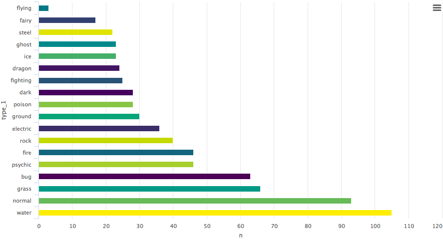
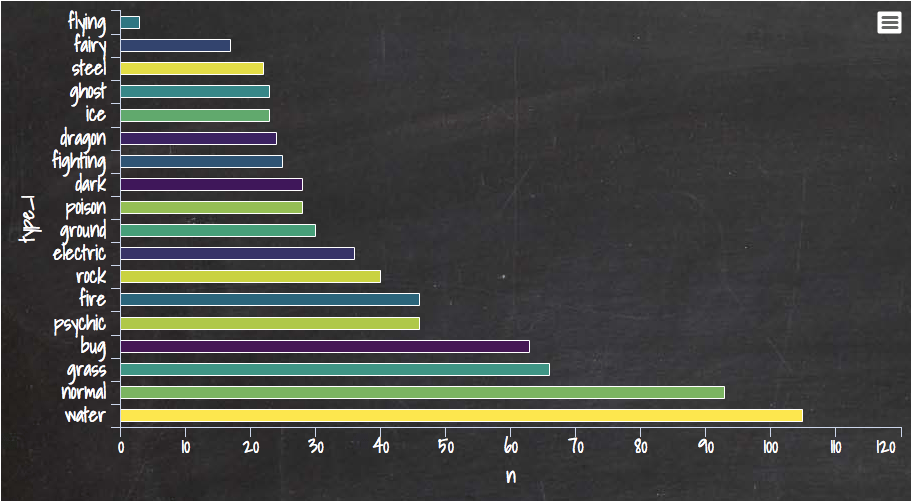
让我们绘制一个条形图。
pokemon%>%
  count(type_1)%>%
  arrange(n)%>%
  hchart(type = "bar", hcaes(x = type_1, y = n))
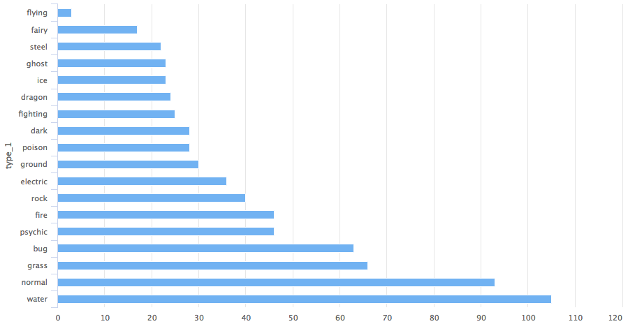
因此, 你获得了有关神奇宝贝的1类类别的条形图。
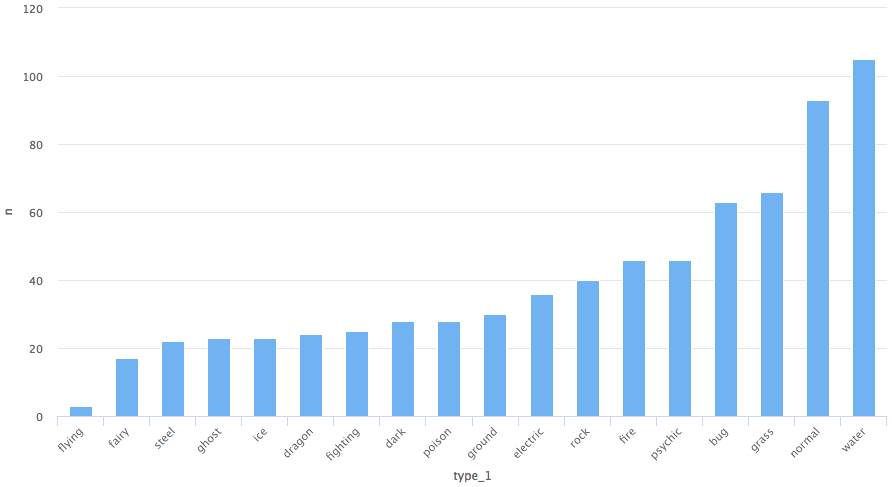
假设你要使用柱形图, 则唯一需要更改的变量是柱的类型。
pokemon%>%
  count(type_1)%>%
  arrange(n)%>%
  hchart(type = "column", hcaes(x = type_1, y = n))
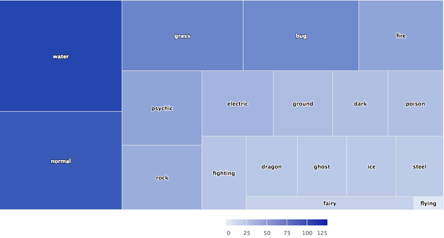
树状图
pokemon%>%
  count(type_1)%>%
  arrange(n)%>%
  hchart(type = "treemap", hcaes(x = type_1, value = n, color = n))
我们还可以使用hc_add_series绘制图表。它用于从highchart对象添加和删除序列。
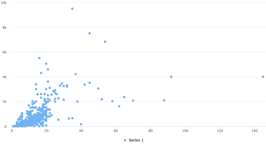
散点图
highchart()%>%
  hc_add_series(pokemon, "scatter", hcaes(x = height, y = weight))
ggplot2的geom_函数和hc_add_series的主要区别在于, 我们需要在每个函数中显式添加数据和美观, 而在ggplot2中, 可以在一个图层中添加数据和美观, 然后可以进一步添加更多可以在相同数据和美观上使用的几何。
下面使用ggplot2软件包中的diamond数据集给出了一个准确的示例。
data(diamonds, package = "ggplot2")

set.seed(123)
data <- sample_n(diamonds, 300)

modlss <- loess(price ~ carat, data = data)
fit <- arrange(augment(modlss), carat)

highchart() %>%
  hc_add_series(data, type = "scatter", hcaes(x = carat, y = price, size = depth, group = cut)) %>%
  hc_add_series(fit, type = "line", hcaes(x = carat, y = .fitted), name = "Fit", id = "fit") %>%
  hc_add_series(fit, type = "arearange", hcaes(x = carat, low = .fitted - 2*.se.fit, high = .fitted + 2*.se.fit), linkedTo = "fit")
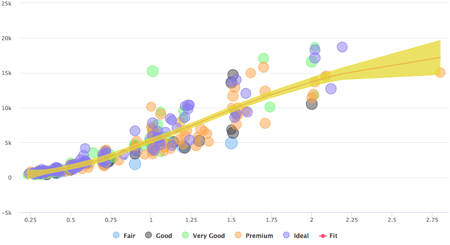
如示例中给出的, 使用包括散点图, 线和面积范围的三个系列来绘制图形。
让我们使用hc_add_series将highchart的javascript开发复制到R中。
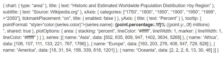
highchart() %>%
  hc_chart(type = "area") %>%
  hc_title(text = "Historic and Estimated Worldwide Population Distribution by Region") %>%
  hc_subtitle(text = "Source: Wikipedia.org") %>%
  hc_xAxis(categories = c("1750", "1800", "1850", "1900", "1950", "1999", "2050"), tickmarkPlacement = "on", title = list(enabled = FALSE)) %>%
  hc_yAxis(title = list(text = "Percent")) %>%
  hc_tooltip(pointFormat = "<span style=\"color:{series.color}\">{series.name}</span>:
             <b>{point.percentage:.1f}%</b> ({point.y:, .0f} millions)<br/>", shared = TRUE) %>%
  hc_plotOptions(area = list(
     stacking = "percent", lineColor = "#ffffff", lineWidth = 1, marker = list(
       lineWidth = 1, lineColor = "#ffffff"
       ))
     ) %>%
  hc_add_series(name = "Asia", data = c(502, 635, 809, 947, 1402, 3634, 5268)) %>%
  hc_add_series(name = "Africa", data = c(106, 107, 111, 133, 221, 767, 1766)) %>%
  hc_add_series(name = "Europe", data = c(163, 203, 276, 408, 547, 729, 628)) %>%
  hc_add_series(name = "America", data = c(18, 31, 54, 156, 339, 818, 1201)) %>%
  hc_add_series(name = "Oceania", data = c(2, 2, 2, 6, 13, 30, 46))
比较时, 你可以看到每个javascript代码块都转换为彼此之间通过管道传递的R函数。我们可以使用与Java代码相同的格式查看一些参数, 例如hctooltip的pointFormat, 你可以在其中查看详细信息。
高库存
Highstocks是用于财务和时间序列分析的图表, 它与quamtmod库配合使用, 并且易于绘制符号图表, 然后可以使用hc_add_series添加更多系列。
x <- getSymbols("GOOG", auto.assign = FALSE)

hchart(x)
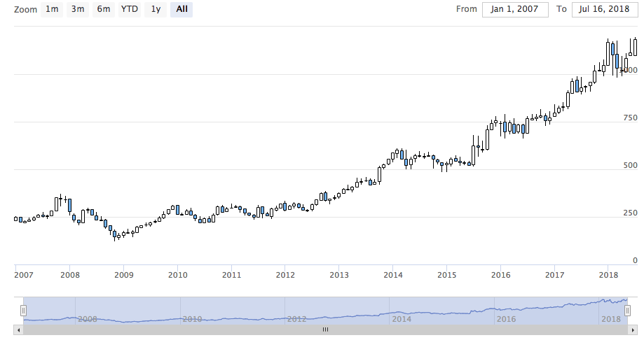
如图所示, 我们不需要添加其他代码, xts对象容纳的hchart非常有效地提供了数据的动态快照。你可以使用缩放功能将数据细分成较小的块, 以进行更好的分析。
让我们使用hc_add_series。
y <- getSymbols("AMZN", auto.assign = FALSE)

highchart(type = "stock") %>%
  hc_add_series(x) %>%
  hc_add_series(y, type = "ohlc")
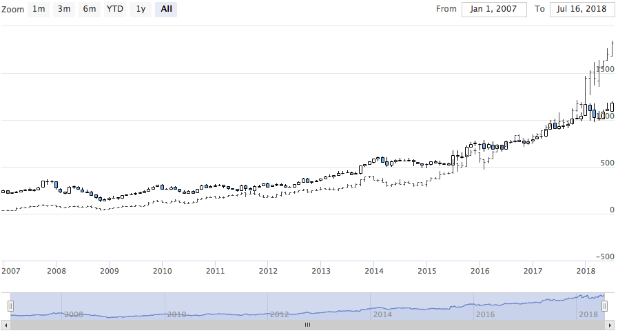
如你所见, 可视化可以非常有效地调整大量数据。
请尝试使用具有不同xts对象的股票。
高图
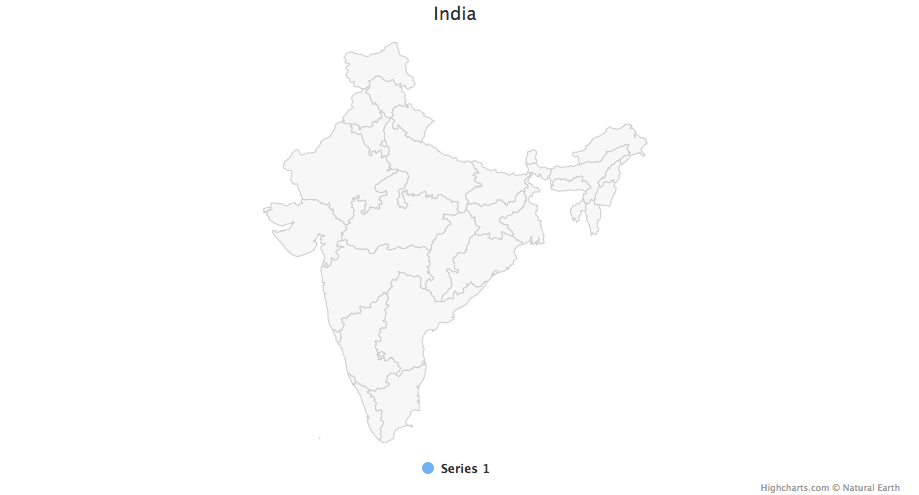
使用highcharter绘制地图的最简单方法是使用hcmap函数。从highmaps集合中选择一个URL, 然后将该URL用作hcmap函数中的地图。这将下载地图, 并使用info作为mapdata参数创建一个对象。
让我们绘制印度的地图。
hcmap("https://code.highcharts.com/mapdata/countries/in/in-all.js")%>%
  hc_title(text = "India")
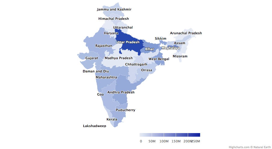
好吧, 那是一张普通的地图, 如何将其转换为choropleths。
从highcharts地图集中下载的每个地图数据都有键来加入数据。有2个函数可帮助你了解编码哪些区域以了解如何结合地图和数据:
- download_map_data:从highcharts集合下载geojson数据。
- get_data_from_map:获取地图中每个区域的属性, 作为地图数据中的键。
mapdata <- get_data_from_map(download_map_data("https://code.highcharts.com/mapdata/countries/in/in-all.js"))

glimpse(mapdata)
## Observations: 34
## Variables: 20
## $ `hc-group`    <chr> "admin1", "admin1", "admin1", "admin1", "admin1"...
## $ `hc-middle-x` <dbl> 0.65, 0.59, 0.50, 0.56, 0.46, 0.46, 0.51, 0.59, ...
## $ `hc-middle-y` <dbl> 0.81, 0.63, 0.74, 0.38, 0.64, 0.51, 0.34, 0.41, ...
## $ `hc-key`      <chr> "in-py", "in-ld", "in-wb", "in-or", "in-br", "in...
## $ `hc-a2`       <chr> "PY", "LD", "WB", "OR", "BR", "SK", "CT", "TN", ...
## $ labelrank     <chr> "2", "2", "2", "2", "2", "2", "2", "2", "2", "2"...
## $ hasc          <chr> "IN.PY", "IN.LD", "IN.WB", "IN.OR", "IN.BR", "IN...
## $ `alt-name`    <chr> "Pondicherry|Puduchcheri|Pondichéry", "Ã\u008dl...
## $ `woe-id`      <chr> "20070459", "2345748", "2345761", "2345755", "23...
## $ fips          <chr> "IN22", "IN14", "IN28", "IN21", "IN34", "IN29", ...
## $ `postal-code` <chr> "PY", "LD", "WB", "OR", "BR", "SK", "CT", "TN", ...
## $ name          <chr> "Puducherry", "Lakshadweep", "West Bengal", "Ori...
## $ country       <chr> "India", "India", "India", "India", "India", "In...
## $ `type-en`     <chr> "Union Territory", "Union Territory", "State", "...
## $ region        <chr> "South", "South", "East", "East", "East", "East"...
## $ longitude     <chr> "79.7758", "72.7811", "87.7289", "84.4341", "85....
## $ `woe-name`    <chr> "Puducherry", "Lakshadweep", "West Bengal", "Ori...
## $ latitude      <chr> "10.9224", "11.2249", "23.0523", "20.625", "25.6...
## $ `woe-label`   <chr> "Puducherry, IN, India", "Lakshadweep, IN, India...
## $ type          <chr> "Union Territor", "Union Territor", "State", "St...
#population state wise
pop = as.data.frame(c(84673556, 1382611, 31169272, 103804637, 1055450, 25540196, 342853, 242911, 18980000, 1457723, 60383628, 25353081, 6864602, 12548926, 32966238, 61130704, 33387677, 64429, 72597565, 112372972, 2721756, 2964007, 1091014, 1980602, 41947358, 1244464, 27704236, 68621012, 607688, 72138958, 3671032, 207281477, 10116752, 91347736))

state= mapdata%>%
  select(`hc-a2`)%>%
  arrange(`hc-a2`)

State_pop = as.data.frame(c(state, pop))
names(State_pop)= c("State", "Population")

hcmap("https://code.highcharts.com/mapdata/countries/in/in-all.js", data = State_pop, value = "Population", joinBy = c("hc-a2", "State"), name = "Fake data", dataLabels = list(enabled = TRUE, format = '{point.name}'), borderColor = "#FAFAFA", borderWidth = 0.1, tooltip = list(valueDecimals = 0))
用hc_add_series和maprochoths做一些实验。有关一些详细信息和示例, 请访问此处。
外挂程式
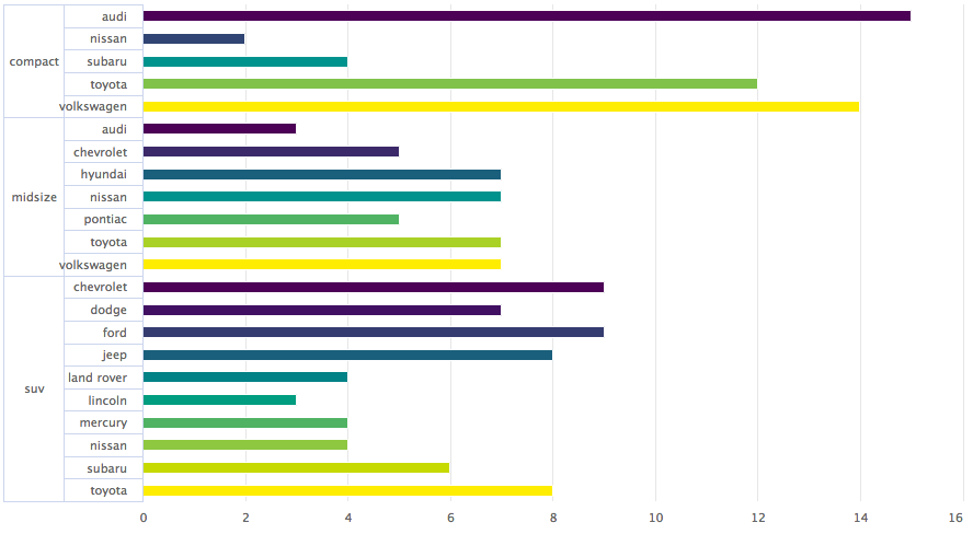
现在, 让我们尝试一些由highcharter提供的插件, 例如分组, 下钻, 下载, 打印数据以及一些很棒的主题。
让我们对mpg数据集的数据进行分组, 在这里为了更好地可视化, 我们创建了一个列表, 该列表根据制造商对数据进行分类。
data(mpg, package = "ggplot2")

mpgg <- mpg %>%
  filter(class %in% c("suv", "compact", "midsize")) %>%
  group_by(class, manufacturer) %>%
  summarize(count = n())

categories_grouped <- mpgg %>%
  group_by(name = class) %>%
  do(categories = .$manufacturer) %>%
  list_parse()

highchart() %>%
  hc_xAxis(categories = categories_grouped) %>%
  hc_add_series(data = mpgg, type = "bar", hcaes(y = count, color = manufacturer), showInLegend = FALSE)
让我们创建一个图表, 深入到另一个图表以进行更好的分析。如果你了解R中的列表, 则可以更有效地理解代码。
df <- data_frame(
  name = c("Animals", "Fruits", "Cars"), y = c(5, 2, 4), drilldown = tolower(name)
)


ds <- list_parse(df)
names(ds) <- NULL


hc <- highchart() %>%
  hc_chart(type = "column") %>%
  hc_title(text = "Basic drilldown") %>%
  hc_xAxis(type = "category") %>%
  hc_legend(enabled = FALSE) %>%
  hc_plotOptions(
    series = list(
      boderWidth = 0, dataLabels = list(enabled = TRUE)
    )
  ) %>%
  hc_add_series(
    name = "Things", colorByPoint = TRUE, data = ds
  )

dfan <- data_frame(
  name = c("Cats", "Dogs", "Cows", "Sheep", "Pigs"), value = c(4, 3, 1, 2, 1)
)

dffru <- data_frame(
  name = c("Apple", "Organes"), value = c(4, 2)
)

dfcar <- data_frame(
  name = c("Toyota", "Opel", "Volkswage"), value = c(4, 2, 2)
)

second_el_to_numeric <- function(ls){

  map(ls, function(x){
    x[[2]] <- as.numeric(x[[2]])
    x
  })

}

dsan <- second_el_to_numeric(list_parse2(dfan))

dsfru <- second_el_to_numeric(list_parse2(dffru))

dscar <- second_el_to_numeric(list_parse2(dfcar))

hc %>%
  hc_drilldown(
    allowPointDrilldown = TRUE, series = list(
      list(
        id = "animals", data = dsan
      ), list(
        id = "fruits", data = dsfru
      ), list(
        id = "cars", data = dscar
      )
    )
  )
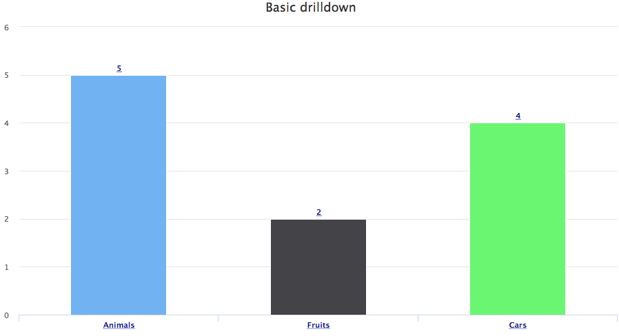
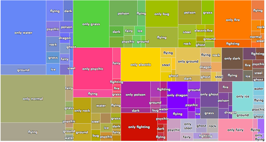
让我们在其他图表上应用向下钻取。
tm <- pokemon %>%
  mutate(type_2 = ifelse(is.na(type_2), paste("only", type_1), type_2), type_1 = type_1) %>%
  group_by(type_1, type_2) %>%
  summarise(n = n()) %>%
  ungroup() %>%
  treemap::treemap(index = c("type_1", "type_2"), vSize = "n", vColor = "type_1")
.
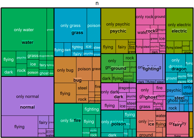
tm$tm <- tm$tm %>%
  tbl_df() %>%
  left_join(pokemon %>% select(type_1, type_2, color_f) %>% distinct(), by = c("type_1", "type_2")) %>%
  left_join(pokemon %>% select(type_1, color_1) %>% distinct(), by = c("type_1")) %>%
  mutate(type_1 = paste0("Main ", type_1), color = ifelse(is.na(color_f), color_1, color_f))

highchart() %>%
  hc_add_series_treemap(tm, allowDrillToNode = TRUE, layoutAlgorithm = "squarified")
让我们添加导出数据的功能。
pokemon%>%
  count(type_1)%>%
  arrange(n)%>%
  hchart(type = "bar", hcaes(x = type_1, y = n, color = type_1))%>%
  hc_exporting(enabled = TRUE)
最后, 我们添加一些主题。
pokemon%>%
  count(type_1)%>%
  arrange(n)%>%
  hchart(type = "bar", hcaes(x = type_1, y = n, color = type_1))%>%
  hc_exporting(enabled = TRUE)%>%
hc_add_theme(hc_theme_chalk())
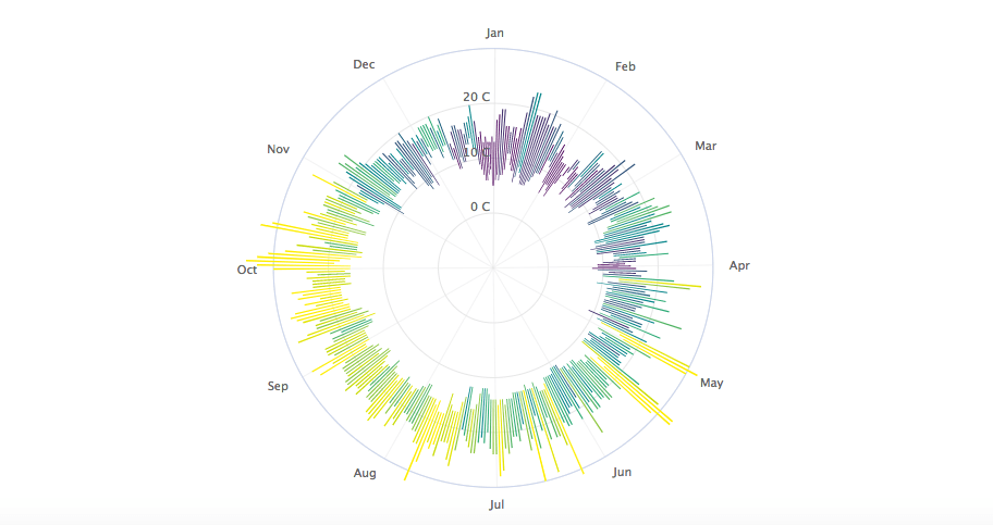
你可以从这里学到很多东西, 它是Highcharter的完整库。我还共享了我在天气数据集上创建的最喜欢的图形之一, 这里通过将参数设置为TRUE来使用有趣的参数Polar之一, 整个故事都将得到转换。
data("weather")

x <- c("Min", "Mean", "Max")
y <- sprintf("{point.%s}", c("min_temperaturec", "mean_temperaturec", "max_temperaturec"))
tltip <- tooltip_table(x, y)

hchart(weather, type = "columnrange", hcaes(x = date, low = min_temperaturec, high = max_temperaturec, color = mean_temperaturec)) %>%
  hc_chart(polar = TRUE) %>%
  hc_yAxis( max = 30, min = -10, labels = list(format = "{value} C"), showFirstLabel = FALSE) %>%
  hc_xAxis(
    title = list(text = ""), gridLineWidth = 0.5, labels = list(format = "{value: %b}")) %>%
  hc_tooltip(useHTML = TRUE, pointFormat = tltip, headerFormat = as.character(tags$small("{point.x:%d %B, %Y}")))
如果你想了解有关R中数据可视化的更多信息, 请参加srcmini的ggplot2数据可视化(第1部分)课程。
评论前必须登录!
注册